Picture this: you’ve just brewed a fresh cup of coffee, but instead of admiring your kitchen, your eyes land on a countertop that feels… dated. Sound familiar? If you’re nodding, you’re not alone. Countertop color is one of the fastest ways to modernize—or accidentally age—your entire space. Today, we’re diving deep into the freshest countertop color trends and, more importantly, how you can weave them seamlessly into your unique home style. Whether you’re eyeing a full remodel or a simple refresh, let’s explore the hues that will keep your kitchen, bath, or bar top looking vibrant for years to come.
Quick Stat: According to a 2024 Houzz Kitchen Trends Study, 42% of homeowners said countertop color influenced their entire palette more than cabinet color or flooring.
1. Why Color Matters More Than Ever in Countertop Design
Color is more than aesthetics; it’s the mood‑setter and style anchor of any room. In high‑traffic areas like kitchens and bathrooms, countertops are a dominant visual element. A well‑chosen hue can:
Create Cohesion: Tie cabinets, flooring, and backsplash together, creating a seamless visual flow.
Shift Perception: Light shades make small kitchens feel larger; darker tones add intimacy and drama.
Boost Resale Value: On‑trend yet timeless colors signal quality and modernity to future buyers.
Highlight Function Zones: Contrasting island colors can subtly divide prep and dining areas in open‑concept layouts.
Express Personality: Your countertop is a daily touchpoint—its color should make you smile every time you set down a mug.
With open‑concept floor plans on the rise, countertops often stretch into living or dining zones, making color harmony crucial across multiple spaces. Imagine a waterfall island in soft gray quartz flowing into a dining table clad in matching stone—it’s cohesive, luxurious, and undeniably Instagram‑worthy.
2. Current Dominant Color Trends You’ll See Everywhere
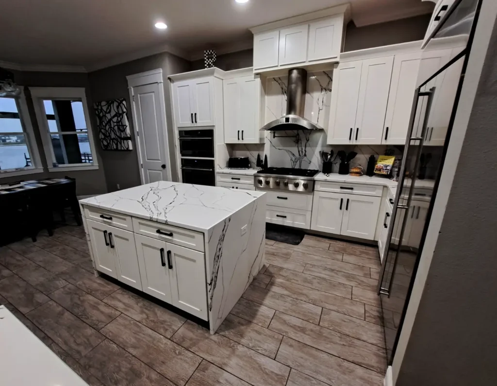
2.1 Classic Whites & Soft Grays
It’s no surprise that whites and soft grays remain top sellers for granite countertops Orlando and beyond. These shades deliver a clean canvas that pairs with almost any cabinet finish—from sleek matte black to warm wood tones. Quartz manufacturers have perfected subtle veining, giving you the marble look without the maintenance. If you crave brightness and versatility, classic neutrals are still a safe (and stunning) bet.
Pro Tip: Opt for a polished finish to amplify natural light or a honed finish for a velvety, fingerprint‑friendly surface.
2.2 Warm Earthy Neutrals
Beige is back—but this time, it’s sophisticated. Think sandy taupes, creamy almond, and gentle mushroom tones. These neutral countertop colors complement organic materials like rattan, oak, and terracotta. They’re perfect for homeowners who want a cozy, grounded vibe without sacrificing modern appeal.
2.3 High‑Contrast Veining
Bold veining isn’t just for high‑end marble. Engineered stone makers are introducing dramatic, high‑contrast patterns—deep charcoal streaks on bright white quartz, for example—that create a luxurious focal point. Paired with minimalist cabinetry, these surfaces read as art.
2.4 Subtle Pastels
Soft blush, muted sage, and powder blue quartz are quietly gaining traction among designers craving a hint of color without overpowering a space. When balanced with brass hardware and white oak cabinets, pastels feel fresh yet refined.
2.5 Industrial‑Inspired Tones
Concrete‑look quartz in ash gray or weathered charcoal brings an urban edge to loft apartments and modern farmhouses alike. The beauty? You get the raw aesthetic of concrete without the cracking or staining worries.
Inspired by nature, rich blues and greens are making waves in quartz countertops Orlando showrooms. Picture a midnight‑blue island top paired with brass fixtures or a lush green vanity counter framed by crisp white walls. These hues bring depth and personality while remaining surprisingly versatile.
3.2 Sleek Blacks & Charcoal Hues
Matte black countertops are the little black dress of kitchen design—sleek, dramatic, and undeniably chic. When contrasted with light cabinetry, black stone surfaces create a striking, modern look. Worried about fingerprints? Many new finishes feature subtle texture that masks smudges.
3.3 Terracotta & Rust Accents
Warm, earthy reds are creeping into contemporary palettes. A rust‑toned quartz island can add a pop of color without overwhelming the room. Pair it with neutral cabinets and matte black hardware for a balanced, designer‑approved look.
3.4 Jewel Tones
Emerald, sapphire, and amethyst hues—often seen in semi‑precious stone slabs—are gaining popularity for statement bar tops and powder‑room vanities. They’re not cheap, but they’re unforgettable.
3.5 Metallic‑Infused Quartz
Imagine delicate gold or silver flecks embedded in a creamy base. Metallic‑infused quartz adds understated glamour that catches the light without screaming for attention.
4. Matching Color Trends to Your Home Style
Choosing the right shade isn’t one‑size‑fits‑all. Here’s how to blend today’s countertop color trends with popular décor styles:
4.1 Modern Minimalist
Go‑to Palette: Snow‑white quartz, cool gray concrete looks, or pure black surfaces.
Why It Works: Clean lines and neutral tones keep the focus on architectural simplicity.
Design Tip: Pair with handle‑less cabinets and linear LED lighting for a gallery‑like vibe.
Ten Expert Tips for Choosing Your Perfect Countertop Color
Start with Lighting: Natural light can wash out pale colors or amplify dark ones. Test samples in your space at different times of day.
Consider Cabinetry & Flooring: Your countertop should complement—not compete with—these fixed elements.
Think Long‑Term: Trends are fun, but durability matters. Neutral bases with subtle patterning often age gracefully.
Order Large Samples: A 2×2‑inch swatch can’t capture full veining. Many suppliers offer larger cut‑offs or virtual visualizers.
Work with Pros: A local fabricator specializing in stone countertop installation can guide you through slab selection and edge profiles.
Mind the Finish: Polished surfaces reflect more light; honed or leathered finishes hide smudges and create tactile interest.
Test Against Backsplash Samples: Bring tiles or paint chips to the slab yard for real‑world comparisons.
Plan for Seam Placement: Busy patterns hide seams better than solid colors.
Account for Maintenance: Marble’s beauty comes with etching risks; quartz offers color consistency and stain resistance.
Visualize in 3D: Use augmented‑reality apps from major quartz brands to preview colors in your actual kitchen.
Maintenance & Longevity – How Color Influences Upkeep
Color isn’t just a design choice; it affects day‑to‑day maintenance:
Light Surfaces: Camouflage dust but reveal coffee stains quickly. Seal granite annually to keep whites pristine.
Dark Surfaces: Hide wine spills yet showcase fingerprints. Matte or textured finishes can reduce smudge visibility.
High‑Contrast Veining: Distracts the eye from minor crumbs and water spots—great for busy households.
Pro Cleaning Tip: A pH‑neutral stone cleaner used weekly keeps both light and dark countertops looking showroom‑fresh.
Real‑Life Color Transformations (Mini Case Studies)
The Dated Oak Revival – Orlando homeowners swapped speckled brown laminate for white‑veined quartz, instantly brightening their galley kitchen and increasing appraisal value by $18K.
From Builder‑Basic to Coastal Cool – A condo near Cocoa Beach replaced standard beige granite with pale blue quartz. Paired with shaker cabinets, the space now channels a breezy, vacation‑home feel.
Urban Loft Glow‑Up – A downtown studio embraced concrete‑look quartz on both counters and backsplash, achieving a cohesive, industrial vibe while simplifying cleaning routines.
Frequently Asked Questions About Countertop Colors
Will bold countertop colors hurt resale value? Not if executed tastefully. Pair vibrant surfaces with neutral cabinets and timeless hardware to appeal to a broad audience.
Can I mix two countertop colors in one kitchen? Absolutely. Islands in contrasting hues create visual interest and delineate work zones.
How do I keep white countertops from staining? Choose quartz or properly sealed granite and wipe spills immediately. Avoid harsh chemicals.
Is black granite hard to maintain? Polished black shows smudges, but a leathered finish hides fingerprints. Use a microfiber cloth for quick touch‑ups.
What’s the most timeless countertop color? Soft whites and light grays remain classics, but subtle beige tones are resurging for their warmth.
Are pastel countertops just a fad? Designers predict muted pastels will stick around as homeowners seek gentle, wellness‑inspired palettes.
Conclusion – Ready to Add Color Confidence to Your Countertops?
Choosing the right countertop color is equal parts art and strategy. By understanding both current and emerging trends—plus how they mesh with your home’s style—you’ll land on a surface that feels fresh today and timeless tomorrow. If you’re in Central Florida and want hands‑on guidance, reach out to our team for custom countertop fabrication and a complimentary color consultation. Let’s transform your space into a showstopper you’ll love every single day.